Matt Blease
When deciding upon London as the next city for Bikevibe, there was one name on the top of our list: Matt Blease. The London-based illustrator had been a favourite of ours on Instagram for years. Recognised by his playful lines, sense of humour and skateboard and cycling references, we knew that this was someone we wanted to have a chat with.
Text: Silje Strømmen
Illustration: Matt Blease
With a brother 10 years his senior, Matt was early exposed to BMX and the coolness surrounding it. From day one he knew that he wanted to be part of it.
“Cycling has been a passion since day one really. For me everything was about drawing, skateboarding and BMX. I was so deeply obsessed with all three and they just fed into each other”, Matt says.
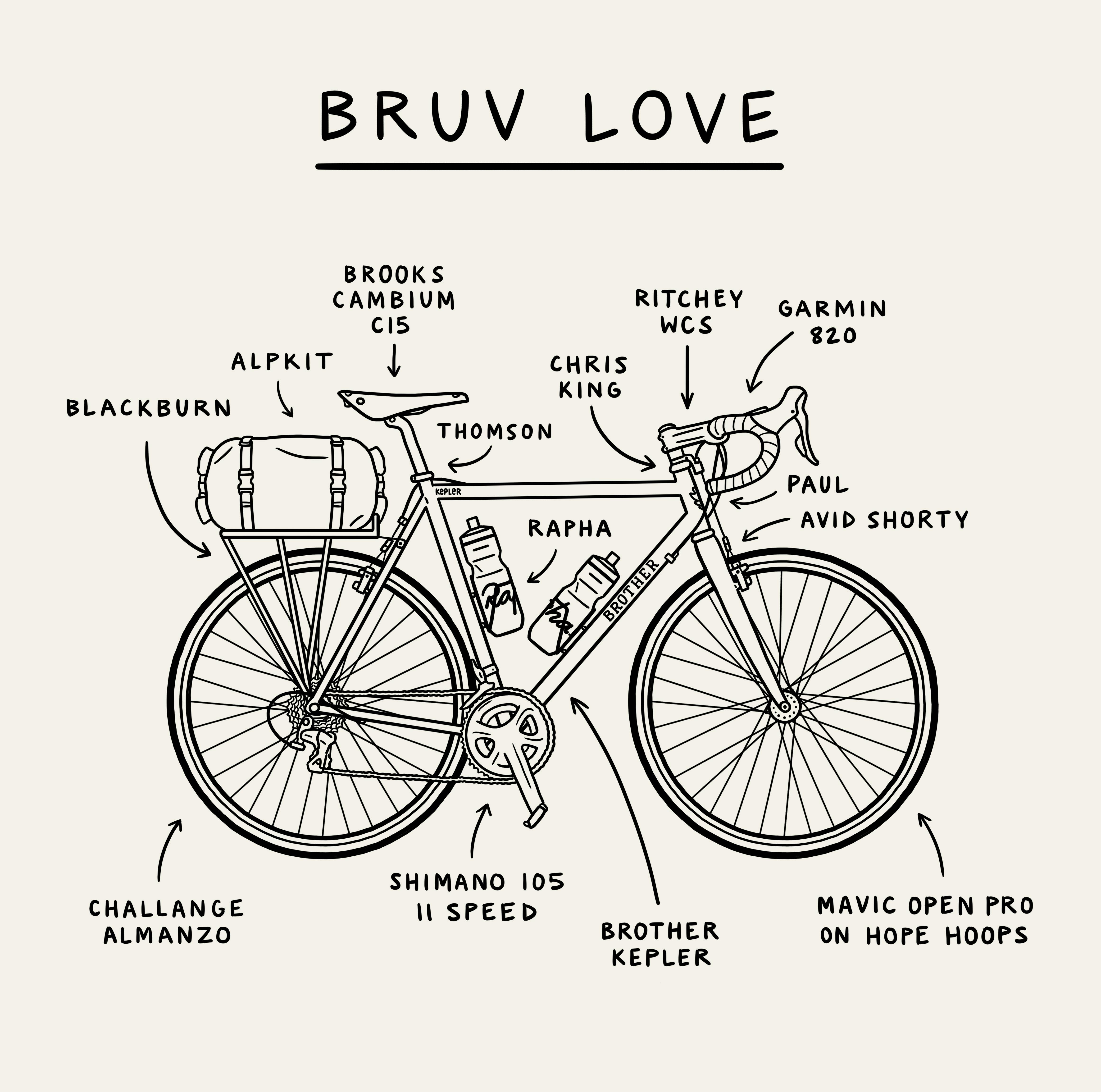
After getting into drawing as a kid (“I think my earliest memory is drawing in class in school, being obsessed the details”) Matt ended up studying furniture and product design. He attended the Design Futures course at Edinburgh’s Napier University before moving to London in 2004. For the last few years he has been working as an illustrator from his studio by the Thames. His work can be found in his weekly spot in The Guardian’s G2 and the client list includes high profiled brands such as Barbour, Brother Cycles and Coca Cola. Recently he also did a partnership with Rapha, resulting in the series “More Than a Race” for the 2016 Tour de France.
“Working with Rapha was amazing. They know my style from previous collaborations and basically said, “Do what you do”. They were so good to work with.
“Working as an illustrator is all about finding the right clients. It needs to be a mutual relationship. Getting to do what I do is amazing. I quit my full time job about three years ago to concentrate on drawing and I’m still in the phase where it doesn’t feel like work. Every day I get to go to my studio and draw and work with amazing clients.
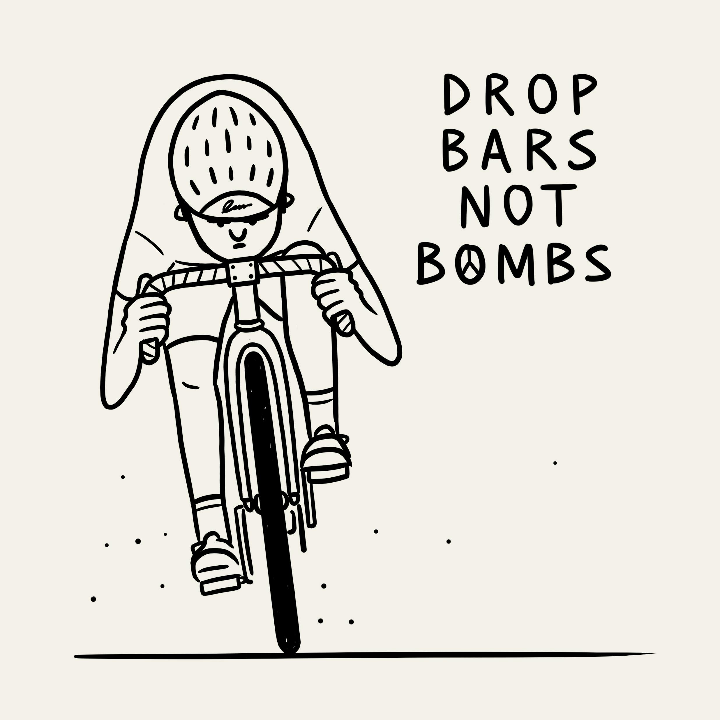
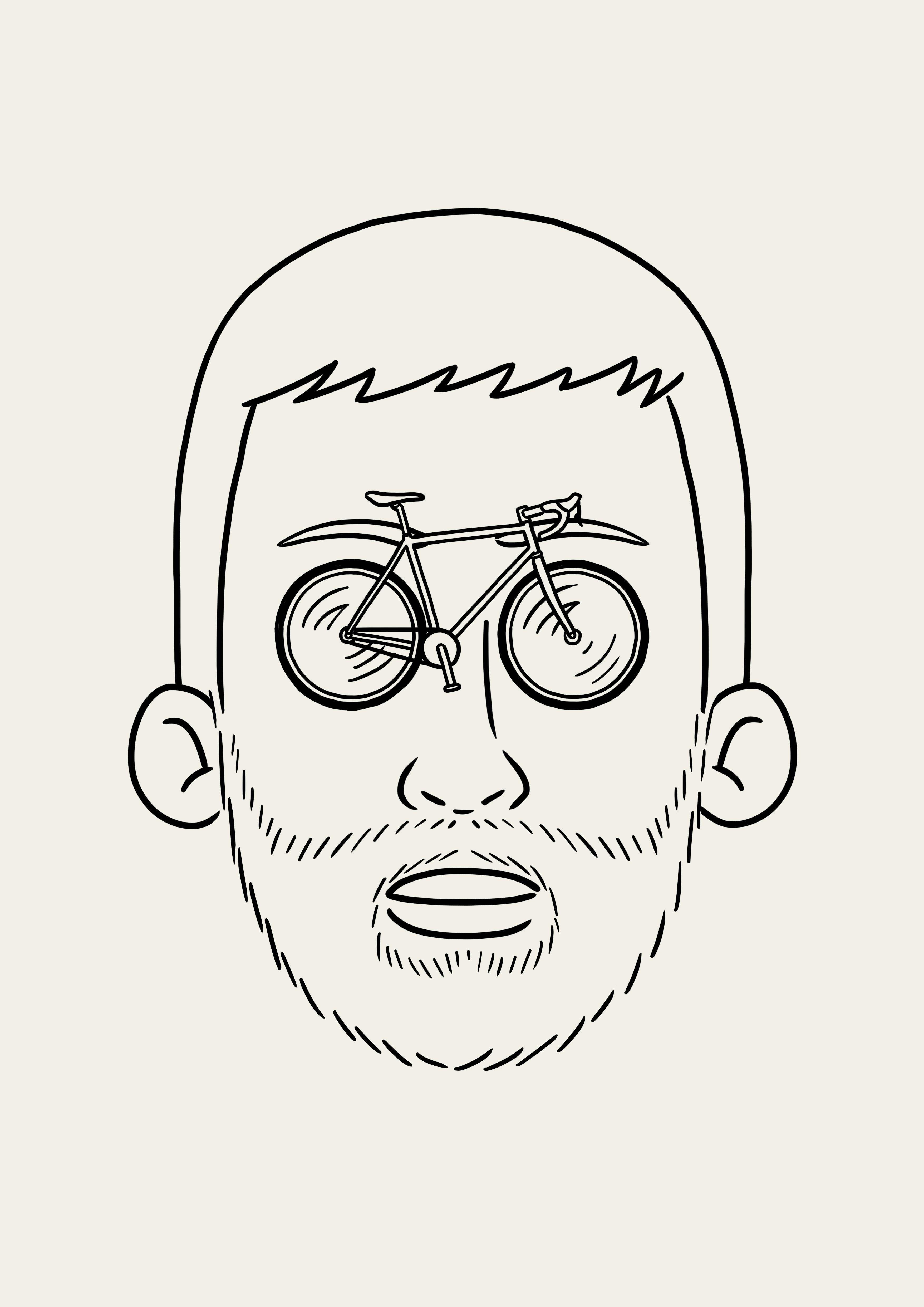
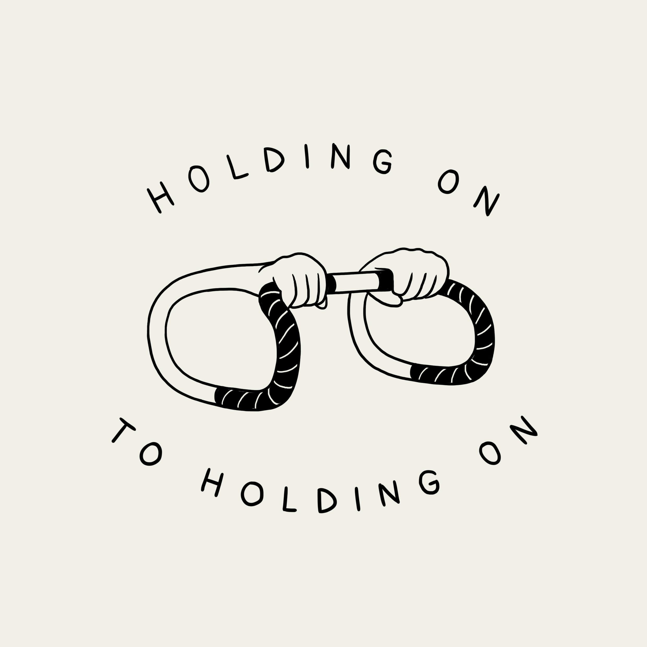
His enthusiasm and love for what he does can easily be found in his work. It has wit and often observes everyday situations in a playful and direct way that tends to leave whoever is watching with a smile on their face.
“I always try to put a spin on things. This is what it can look like from one point of view, how can I look at it differently? This is how I try to approach all of my work. For me, the idea is the most important thing.”
In light of the experiment where an artist asked strangers to draw a bicycle from memory and then 3D rendered the results (just search for “drawing bikes” if you haven’t seen it) we all know how hard bicycle drawings can be. To Matt however, it has always come natural.
“Growing up, kids draw squares, rectangles, circles… I drew bikes. They weren’t always proper, functional bikes, but there were two wheels and a frame.
One must wonder, spending that amount of time drawing bikes, what would one say makes a bike beautiful?
“It got to look badass”, Matt says while laughing. “Every bike got to look badass to me. I have (too many) bikes and most of them are black. They just look cooler, in my opinion. A nice black frame and a considered build also contributes”.
Even though he often takes a boat (yes, a boat) to work Matt still manages to spend a lot of time on two wheels when out and about in London. The cycling scene is good, he says, when you don’t isolate it to commuting.
“For new riders cycling in London can be quite daunting. I panic whenever I see people using the Santander Cycles without a helmet. They have no idea how dangerous it can be. But when you have been riding in the city for some time you get a level of confidence that is needed in order to cycle here. You need to let the cars know that you are there. London and cycling has always inspired my work. I love the realness of London”.